Elements
See the highlights of this website

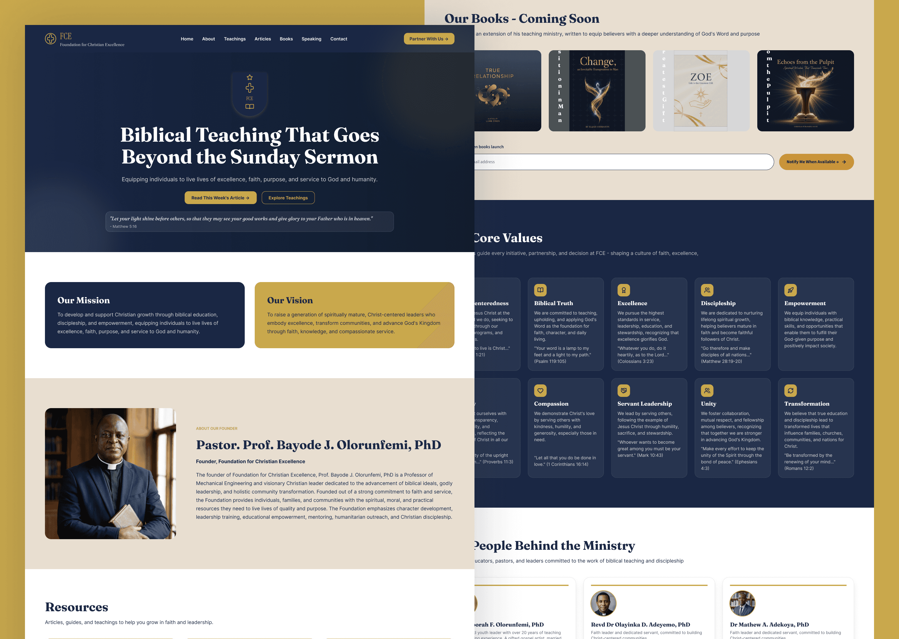
Hero Section
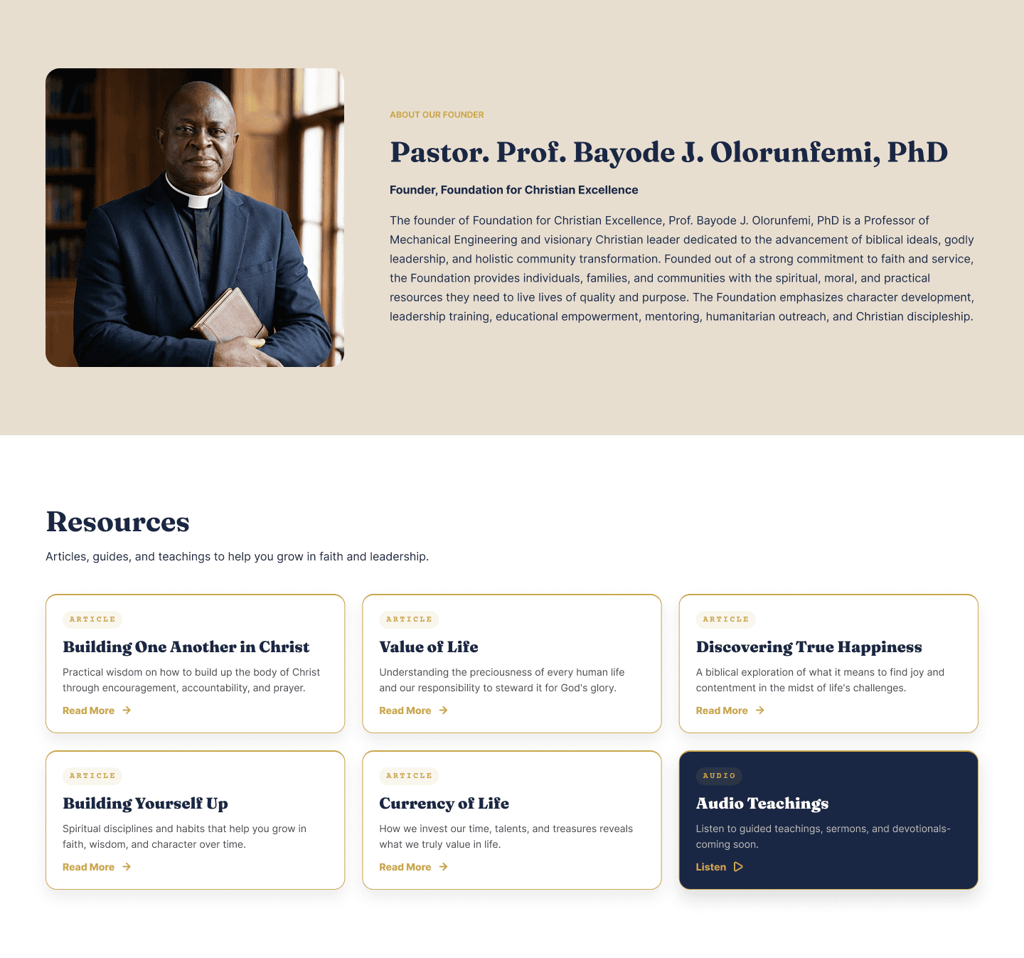
Founder Details

Page Layout

Page Layout
Page Layout

Carrousal

Page Layout

Page Layout
KEY DESIGN DECISIONS
Dual Audience, One Visual Language
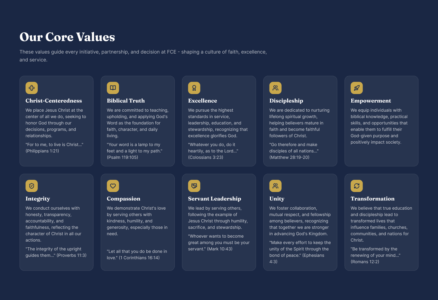
The Foundation for Christian Excellence serves two distinct audiences — the everyday believer seeking weekly spiritual nourishment, and the academic or ministry leader looking for serious theological depth. Rather than designing for one at the expense of the other, the visual language was built to hold both. A deep navy and gold palette carries the weight of scholarship while retaining the warmth of pastoral ministry. Playfair Display brings gravitas to headlines without feeling cold, and Inter keeps body text approachable and readable at every size. The result is a site that feels credible to a professor and welcoming to a first-time visitor in equal measure.
Teaching Ministry, Not a Church
One of the most deliberate decisions in this project was defining what the site should not feel like. Foundation for Christian Excellence is not a congregation — it is a teaching ministry, and every copy and design decision had to reinforce that distinction. Section labels were renamed, CTAs were rewritten, and the entire content hierarchy was restructured around learning and equipping rather than attending and belonging. Phrases like "join our congregation" were replaced with "go deeper in the Word." The site was designed to feel less like a church homepage and more like the opening pages of a well-written theological textbook — warm, purposeful, and intellectually serious.
Email Collection as the Primary Conversion Goal
From the first wireframe, the site architecture was built around a single primary goal: getting visitors to subscribe to the weekly article newsletter. Rather than placing one generic subscribe form in the footer and hoping visitors would find it, the subscription CTA was woven into five distinct moments across the page — the hero, the weekly writings section, the books coming soon section, the audio teachings section, and the footer — each with fresh, contextual copy tailored to where the visitor was in their journey. This approach treats the email list not as a marketing tool but as the front door to an ongoing teaching relationship.
Content-First Responsive Design
With a primarily Nigerian audience accessing the site on mid-range Android devices, responsive design was not an afterthought — it was a core constraint from the beginning. The site was designed across six breakpoints in Framer, from 1600px desktop down to 375px mobile, with particular attention paid to how the gold-on-navy colour combination performed at lower display brightness and contrast settings common on Tecno and Infinix screens. Typography scales, card layouts, and navigation behaviour were each tested and adjusted per breakpoint to ensure the teaching content remained readable, accessible, and visually consistent regardless of the device a visitor arrived on.
BRANDING
logo-emblem

logo-wordmark